Why Customer Value Optimisation (CVO) is the biggest opportunity for ecommerce brands this year
February 15th, 2023 - When acquiring new customers is 5-25X more expensive than retaining existing ones, focusing on retention and lifetime value is a […]
How a better understanding of behavioural marketing could help ‘recession proof’ a business?
August 31st, 2022 - One of the biggest mistakes facing businesses today is making strategic decisions based on incorrect data and taking survey and […]
Marketing through a downturn
August 26th, 2022 - Now might be the time to save costs… but while you’re slowing down, your competitors are gaining ground. A recent […]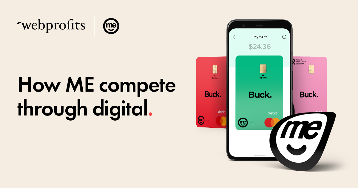
How ME Bank compete through digital
March 10th, 2022 - Have you heard of ME? They’re a bank. Founded in 1994 and originally named Super Member Home Loans ( it […]
How Nespresso Maintain Market Dominance
September 3rd, 2021 - Nespresso changed the coffee industry with their technology in the 80’s. Their new coffee machine with sealed coffee pods allowed […]
How Philips drives D2C sales with digital marketing
June 28th, 2021 - Direct to consumer (D2C) brands have been killing it. According to a guide by Shopify, ecommerce is expected to account […]
Mecca’s eCommerce Growth Strategy
September 2nd, 2020 - Mecca describe themselves as “a high touch, high service beauty boutique supported by a curation of the world’s most luxe […]
Prospa’s Digital Growth Strategy
July 21st, 2020 - Have you heard of Prospa? They’re the #1 online lender for small business across Australia and New Zealand, and they’ve been so successful […]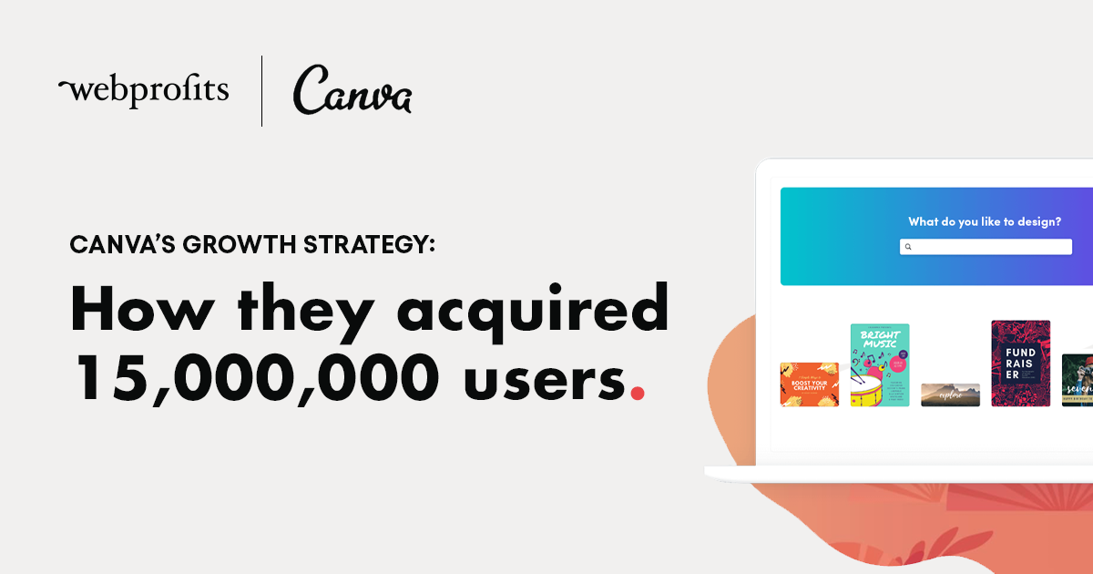
Canva’s Digital Growth Strategy
November 4th, 2019 - Few companies have experienced growth at the same scale as Canva. In less than 7 years, they have acquired over […]
Marketing to Millennials – Lemonade’s Growth Strategy
September 12th, 2019 - Heartless. Bureaucratic. Faceless. These are the images of a modern insurance company. Giant bland offices with row after row of […]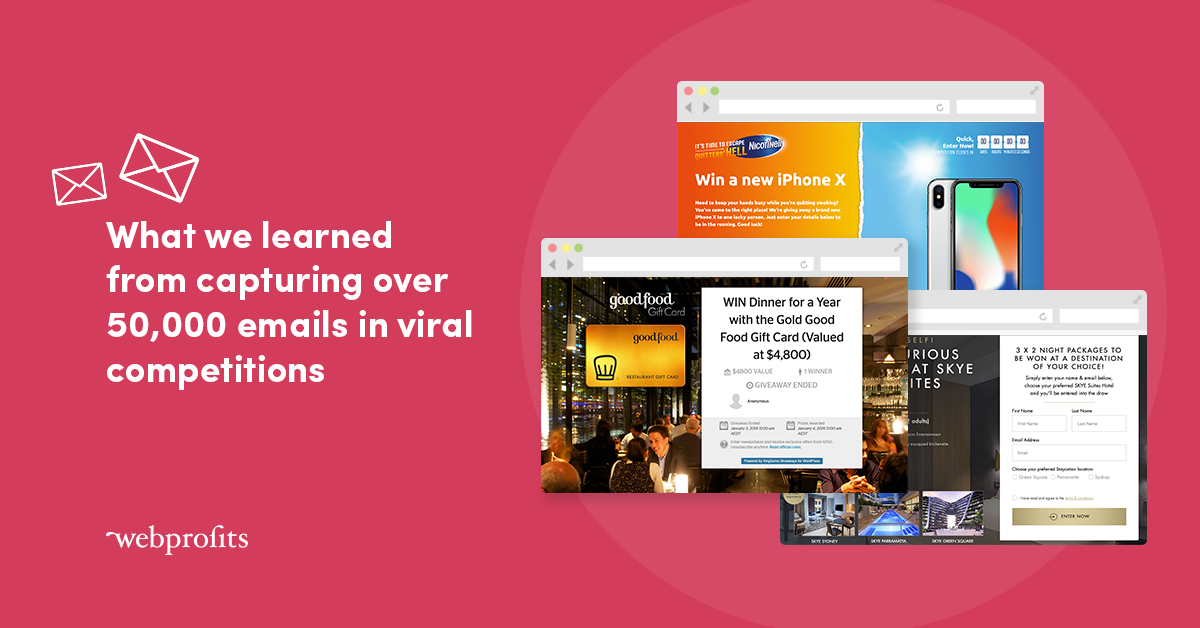
What we learned from capturing over 50,000 emails in viral competitions
July 12th, 2019 - We often hear marketers singing the praises of email – after all, it’s one of the few channels that’s free […]
Airbnb’s Growth Strategy: How they attract and retain 150 million users
May 28th, 2019 - Have you heard of Airbnb? Just kidding, everyone’s heard of Airbnb. Not only did they revolutionise the travel industry, they’re […]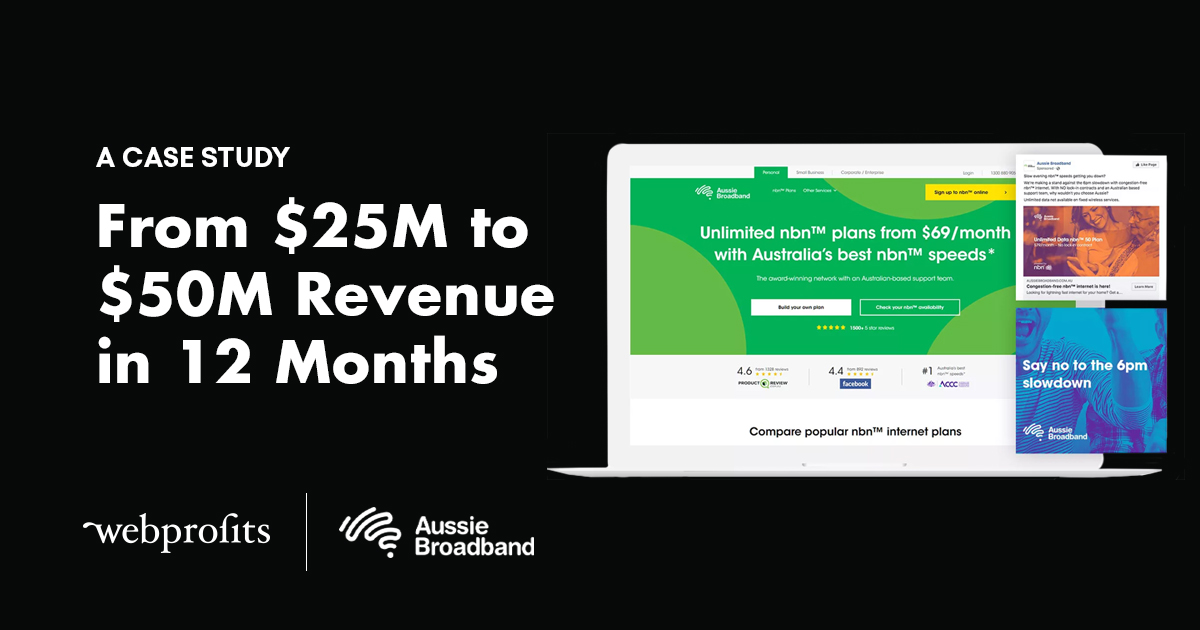
How we doubled Aussie Broadband’s revenue from $25M to $50M Revenue in 12 months
January 21st, 2019 - Aussie Broadband were a small telco servicing rural Australia and providing ADSL + Wireless Internet. With the nbn™ being rolled […]